
Design Divine Marketing Yard Signs
What inspires you to read a marketing yard sign? How many times have you passed one by without taking interest in its message? How many times have you simply been unable to read it?
Before investing in sign advertising, consider a couple of tips:
FUN WITH FONTS
There are so many to choose from. And while some people go for very distinct styles hoping to attract more attention, use caution. You might consider the Times New Roman font overused, but it's easy to read. So is Arial. So is Calibri. Customers shouldn't have to squint to get a clear message, and remember that a clutter of more than two styles can be noisy to the eye.
COLOR BY ASSOCIATION
What color is your product? A coffee shop might use hues of tan to bring in Frappe-craving consumers, while a landscaping supply company could use green. Coloring in one or more hues can be a spectacular tool as long as the lettering differs enough from background shades to keep it clear, attractive and readable. The experts at Carter Associates, Inc. can steer you in the most colorful direction.
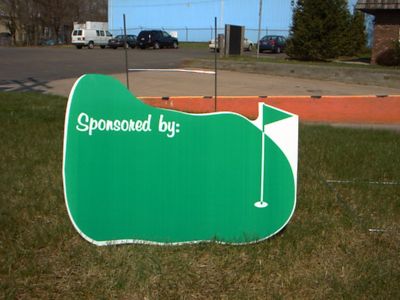
SHAPES
Square signs convey the right message sometimes. But a unique shape can catch just the right set of eyes to move more merchandise, increase attendance or boost awareness. A football or golf-shaped sign for a sporting event, a sign fashioned after a piece of produce for a grocer, or maybe a vehicle-shaped sign for a car dealership. You get the picture.
INFORMATION
How much information is enough to be effective? On the spectrum's other end, consider the costly marketing mistakes of too few details on a sign? There are so many variables - but again, rely on advice from the Carter Associates, Inc. staff. Their expertise makes a world of difference. Just visualize.